About art direction:
1. Buy, Sell, Map and Tab icons:
As graphical design, they are over-detailed and scale poorly (the white "body" of the Humvee gun barrel is only one pixel wide in the image). Compare the equivalent icons in TW and RA3: those are simple and practical, embodying good design principles.
2. Build icons:
I actually find the sample's build icons kinda endearing, reminescent of games from the early 2000s.
Anyway, the original icons in RA95 and C&C95 were intended to feel photorealistic/cinematic. They each has a distinct tone with high-contrast lighting, and suggest a scene in itself (sometimes taken directly from cutscenes). 3D CGI with good color-toning may reproduce the original style better (plus live actor infantry icons as in the original), though I acknowledge this may be outside the remaster's budget range.
3. UI texture:
In the sample image, the remaster team has interpreted the TD UI as weathered dark metal with scratches. I have a lot to say about that.
TD's general aesthetic is one of modern military cool with a few futuristic elements.
RA's style is dieselpunk with retro future tech. From the music to the sprites of damaged buildings, RA's heavy industry aesthetic always feels grungier, more brutal than TD. This styling is continued even in RA2.
Now, one signature UI texture in RA is the polished stainless steel (complete with fine polish marks), seen in both the main menu and in-game UI. So here is the problem: when the remaster team moves to RA, and reproduces its polished steel UI, they will inadvertently make RA appear cleaner than TD, reversing the two games' intended aesthetics.
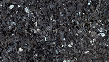
We can attribute this problem to Westwood, who created RA95 first, and when porting TD, chose to give it the dark texture to distinguish it from RA95. However, I think the right way to look at it, is to realize the TD UI texture was probably never meant to be metallic.
It was black granite, which actually fits into Tiberium's crystalline mineral theme.
My suggestion is to keep the sample image's faintly blue/green hue (which IS well-chosen), while replacing the metal with a granite texture. It will be challenging: the granite grain can easily appear too noisy, but if done right, the result will be even more authentic to C&C95.